Thursday, 14 June 2012

wk14

Everything comes to an end and even DMP is going to finish soon. This is probably the last post regarding this project but of course not the last on this blog. The following images are in Slovene because my presentation booklet will bi in this language.


Although there are not many really impressive parts in this project I really learned a lot from this subject. Mostly from exploring the programs on my own. When I started working with cinema it was the first time I ever used 3D rendering program and I was a bit lost now I can at least create something that looks 3D if not more. Most helpful was the part where we were working with autoCAD since I learned a lot of new things (How to use layers, change dimension styles, hatch etc. ).

I learned so much at this subject and the things I learned were more useful then things we learned at other subject. That is why I think this subject should take full year not only one semester (it should change some other full year subjects that are really full of none useful information and stuff that I will probably never use in my life again).

I will end this post with a nice quote from Marry Wilson Little and thank you again for all the new knowledge I got this semester: 

"He who devotes sixteen hours a day to hard study may become at sixty as wise as he thought himself at twenty"


Tuesday, 29 May 2012

wk13

We are near the end of our DMP program. Thirteen weeks have passed since we started and now it was time that we start working on our booklet design.

I have created first page of my presentation booklet using InDesign and of course Photoshop. If I am totally honest I do everything with Adobe Photoshop, I would probably make myself a cup of coffee with it if I could.

I wanted my first page to show small blurred chunks of my project. With that I wanted to light that spark of interest in reader when they look at the booklet without opening it.  Although I am satisfied with the result of the first page I am pretty sure that design will change a bit for the final product.


Tuesday, 22 May 2012

wk12

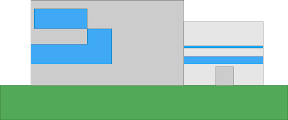
On week 12 we had to correct our phasade. Since I was not happy with the first phasade I made in photoshop, I created a quick remake of it in Illustrator.  It still looks really simple but it shows us the position of windows and door on our my building.


After I have created the phasade I went to InDesign and tried to design my booklet. It did not look as I wanted so I will not publish that yet. At least for now.


Here I added a really nice InDesign starter tutorial. It really helps a lot if you are new to this program.

Tuesday, 15 May 2012

wk11

New week has come and we had to do Photoshop edit of the space in which our building resides. Since my computer is still broken I had to use 6 years old machine to do new renderings and Photoshop editing. And because of that renderings are far from perfect. The lack of good image of the premises did not help either.

After I created new rendered picture with the right angle of the building that matched the one on the photo I copied both the picture of the area and the rendering into Photoshop. I used tools such as clone stamp tool, lasso tool, brush tool and many other similar tools to edit the building. Because the tree was blocking the view I had to put the building behind it. Here things became complicated since the image quality was really poor and the rendering was done in geometry anti-aliasing since my old computer could not handle higher quality. The result was picture with a lot of holes and spots which was not satisfying at all. But as they say something is better than nothing.


After I posted this montage I noticed that the perspective of my rendering is all wrong... so I need to change that.

Here is an interesting tutorial that shows us a really interesting montage. No it is not a building its just an elephant :)

Tuesday, 8 May 2012

wk10.1


If I am completely honest, I did not even noticed that Helvetica was used so often! Once I started looking for it I saw its power in modern marketing and advertising. People walk around not knowing that almost every sign is written by Helvetica. It shows us how much a designer can do if he has a good IDEA. He can change the world! 


It appears in everything, if you check your web browser almost every word is written in Helvetica. Every word in windows operating system is by default written in Helvetica.


Helvetica


Although I do not know a lot about typography and stuff related to fonts this movie opened a new, interesting door into the world of exploration for me. To be honest I watched the movie Helvetica and my lack of knowledge in font design limited me to see all the problems that appear in Helvetica. 
Helvetica (2007)


Link to the movie info: CLICK HERE

Maybe you have noticed but this article was written in HELVETICA!

wk10

My computer is still in repair  because it seems, as I expected, its processor was broken. That is why I could not do new pictures this week.

But unfortunately I have already made Pictures that are needed for this exercise few weeks ago since I have already used different lights at the time. I used Light that emulates the sky and the light that makes shadows "blue" (realistic). 


Rendering from week 7 had rough shadows and did not have any noticeable textures 


Rendering from week 8 had  a little bit more brighter shadows but they were still to dark, because at the time I did not know that sky emits blue light which makes the shadows brighter and blue.

On week 9 I have created first rendering which had "blue" shadows. I have added sky light with its colour turned to light blue. I have changed the opacity of the blue colour so that it was soft and smooth.


Although I could not make new rendering, because my computer is broken I tried my best at finishing at least some part of the exercise. I have learned a lot from past 4 weeks and with the help of DMP I fell in love with cinema 4D and 3D design (Figuratively speaking of course)


Here I will add a tutorial for cinema that shows us how to make the shadows and lighting in cinema 4D


Tuesday, 24 April 2012

wk9

Today was the last day of the wk9 exercise and my computer did not agree with me finishing it! It was freezing randomly every time my CPU (Central processing unit) was loaded with new work... I was only able to complete and save 1 rendered picture before it crashed.

The basic idea of this exercise was to add textures to our 3D models. Since I have already done most of this stuff I just made few changes. I changed and fixed grass texture that looked horrible in the last exercise. The textures of the trees were fixed, but phasade stayed the same as before.


Only rendered picture that I was able to create before my computer crashed multiple times in a row!
Although the lights will be used in exercise wk10 I have played with them for a while. I have added new lights for more smooth shadows. Then added a small amount of blue that would simulate the sky reflection. Then at the end the clouds were added to the rendered picture!

Since I have added most of the things to my model on wk7 and wk8 I am just going to correct old things and maybe add a few new ones during its creation.


Here is a tutorial on texture mapping for cinema 4D. 

Tuesday, 17 April 2012

wk8

So yet another week has come and I have more interesting stuff to show. Although the stuff is really similar on the outside the rendering was created with a different approach. We had to create 3D rendering of our building with the use of file import. In other words that means that we had to "draw", extrude etc. our model with the help of imported autoCAD or archiCAD file.

Here are some examples of my new renderings!

I have added grass texture to the rendering, but it is to large so it looks like it has mutated... Do not be alarmed :)

I have added some new tree models to the rendering

We can clearly see the direction of the sun from the shadow trajectory!

Although we had to use some plans from autoCAD/archiCAD this exercise was as fun as the last one. I have learned some new and interesting stuff about adding and importing new objects into Cinema! But there is still a long way to go before I will be able to create something more impressive.

For the grande finale I have added this tutorial that shows how to create house/flat in cinema 4D!


Tuesday, 10 April 2012

wk7


The seventh week has come and it was time to make some rendered pictures of our building. At first I wanted to use 3DMax but then decided that Cinema 4D is the right tool, because its UI (user interface) is way better then 3DMax's.

So the first thing I did before creating the main building was doing some exercises.  After that I created a really simple model of the building to which I added windows and doors. The composition of windows was changed from previous exercises, so that will have to be fixed.


render 1

render 2, it appears that the door are a bit asymmetrical so I need to change that.

The textures I used were really simple. Gray phasade, glass texture for windows and some really strange textures for concrete. I need to change that at some point.
render 3


render 4

render 5

I have really learned a lot from this exercise. It was interesting compared to wk 5 and wk6. But we need to do them all so here is a really nice tutorial for cinema 4D hope it helps you.


Tuesday, 3 April 2012

wk6

After the delayed update of wk5 new exercise had to be done. So I have added dimensions to my project.


Dimensions of the project
Edit: As you can see I still have a problem because the numbers are to small. So if someone knows how to correct this please do not hesitate to tell me :)

There should be façade but my autoCAD did not want to make my work easy so I will have to add them at the later time :) I had a bit of the problem with dimensions to. The problem was that I was trying to use comand #/DEMED and that did not show the dimensions in the pdf file. After that I realised that I had really simple tool at the annotate -> Dimension with added standard parameter. :)

As you may have noticed I really hate programs like autoCAD etc.

Here I have added a great video that shows us how to add dimensions to our porject.

wk5

I did not upload this part of the DMP last week because I was sick so I missed the release date. But I have created this section and floor plan a few days ago and did not find time to upload it.

So on week five we had to create sections and floor plans in autoCAD, archiCAD or any similar program.

My section is really simple and represents the two lecture rooms that I implement into my design. Each lecture room has 128 seats. The section plans are drawn without tables which are intended in the project as well.

Section of the lecture rooms.


The layout of the building represents the direction of the seats. The building can be entered through the sliding doors which lead diagonally to the lecture room entrance!

The layout of the building


Unfortunately I did not spend as much time with this exercise as I wanted to. I had few problems with autoCAD, because at the end, when I published my post, the pictures were black and they could not be seen on my page. After that I had to change the colour with overlay function in  Photoshop.

Tuesday, 20 March 2012

wk4


We are already in week 4 of DMP and we jet again need to play with Adobe Illustrator! The starting presentation of our project was needed, so we had to do some kind diagram for the project idea. It could be in 3d as a model or with the use of 2d sections.  For the first part of three pictures I have created a simple 3d presentation of the composition. For this I used 2 simple blocks that connect to each other. 

Two objects that represent the building composition.


The second picture represents the basic composition of the interior space of this building. On the left side there is a setup of the seats (orientation) in the lecture hall. The right side is composed from two parts the upper part that represents the gallery and the lower part which is used as a lobby to both the lecture hall and the gallery.


The project is composed from three main parts


For the last part I decided to represent the full diagram of the area with the sun direction, access from the main road and potential parking space, which is not yet determined. 


Data that is important with the project concept


At first I really wanted to create 3d model based on my sketch. I imported the sketch into the illustrator and then draw some lines on top of it. After a few minutes of drawing all I could see was some non-symmetrical shapes… The plan did not work out so I changed some of the things and what you can see now is the end product. I know it is not much but the past week for me was really hectic so I did not have a willpower to do this few days earlier


This tutorial just blew my mind. Words can not say what this tutorial can show you. Watch it for your self :)

Saturday, 10 March 2012

wk3

Adobe Illustrator 


We are in third week of this subjects task and we were asked to create the representation of the area we will build in. This task was one of the less interesting ones... But it had to be done. 

During this exercise I was using Adobe Illustrator CS5.

First thing I had to do was think of what I am going to represent. Since I don’t have any experience from the field of the area representation it was really hard for me to decide what to represent. 

For the first representation I have created a diagram of the Faculty area where my building will stand. This part represents the composition of the sites materials. There aren’t a lot of plants or grass in the area of the FA. To this diagram I added the arrow that leads to the lower diagram with more transparent colors. The main roll in this part represents the green overlay with the percentage that represents one of the goals that I want to achieve with my project. This goal is at least 10-25% more plants and grass outside of this building.

The presentation of a goal I want to achieve with this project  (correct simular with similar)

Diagram that shows important locations near project area


Sunrise and sunset cycle for projects region area (February, May, August, November) 


Here I added a tutorial for people that want to learn more about creation of graphs and charts in Adobe Illustrator since I know I wasn’t really explaining how to do stuff in Ai.


I wasn’t really excited about this exercise. Making graphs and presentations with Ai is really boring, but we will all have to do/learn it sooner or later so it is got thing to at least start to explore this program which could be really handy if you know how to use it. I learned few new tricks while doing this exercise, but there is still a long way to go for me to create great presentations and fully understand the power of this tool. 


Here is my first sunrise/sunset diagram which I have corrected. After I posted it for the first time the sun on the right wasn't satisfying enough so it had to be changed so the sun itself merged with his side
1st attempt 

Thursday, 1 March 2012

wk2

Create a panorama picture


three corrected photos
The second weeks task for us was to correct pictures that we took and to create panoramic picture from those same photos. The lesson of 2nd week was to learn how to manipulate the image that was previously bad or full of  irregularities. All of the defects were corrected using Photoshop CS5 and Lightroom 4 beta.

First thing I had to do was to correct three random photos for exercise.

After they were finished I continued with Panoramic picture. The first thing that had to be done was correction of contrast and exposure. Of course I corrected white balance to! After playing some time with settings I got results that were pleasing enough to me so I continued to step two.

At step two I had to export all the needed pictures for work with Photoshop. This great program helped me to create a panoramic picture by going to File---> Automate---> Photomerge. After that there were only few simple steps to go. The pictures were selected from my library and after clicking the button OK I had to wait few seconds so the images could be processed and merged.

I was not satisfied with the picture that came out of the process because there were cables in the top left corner. With some help of healing brush tool I corrected that part and used the Crop tool to cut ugly looking edges. After that was done panoramic picture was good to go.

Uncut and uncorrected picture


Showing the correction of the wiring 

The final product - Panoramic picture

I added this great tutorial that will help people with less knowledge of creating a panorama picture.


This exercise was really fun to do! It was fun to watch how clean was the result of merging pictures. The lightroom 4 and Photoshop CS5 are great programs for manipulating with pictures so for everyone that likes to play with such a programs there is only one thing to do, get started!


Tuesday, 28 February 2012

wk1

wk1.1

Pritzker Prize 2012


As we all know Pritzker Prize is one of the most prestigious
 awards that architect can get! They were given to architects such as Tadao Ando, Jean Nouvel, Jorn Utzon etc.

While I was reading Architect magazine on the internet I saw an article on this years winner. The winner is Chinese architect named Wang Shu. 
            He recieved this prize for the building of Ningbo History Museum.
This Prize is something special for Wang Shu as he is the only Chinese man who ever got this prize besides Leoh Ming Pei, who is an American born in China. As the Architect magazin says:

American I.M. Pei, FAIA, who won the award in 1983, is the only other Chinese-born individual to be so honoured. The prize will be formally presented on May 25 in Beijing, a site announced at the presentation of last year's Pritzker Prize to Portugal's Eduardo Souto de Moura in Washington, D.C. Interestingly, the Pritzker Prize website went bilingual earlier this month adding Chinese. It will be interesting to watch in coming years to see if the addition of new languages tips future winners.


To learn more about Wang Shu visit:
http://en.wikipedia.org/wiki/Wang_Shu
To read the full article in Architect Magazine visit: http://www.architectmagazine.com/architecture/wang-shu-wins-2012-pritzker-prize.aspx


Thursday, 23 February 2012

wk1

First thing to say about the last thing to do


The second semester started and we had to visit our beloved faculty. Along with second part of the year we gained 2 new subjects. One of them is called DMP or in other words Digital methods and presentations. We were all positively surprised, when our first two lectures were filled with a lot, and I mean a LOT, of positive energy. While there were many interesting things about subject itself we were presented with some even more interesting opinions about modern society school system.
            Our lecturers have opened many new interesting views on the subject of school education and although most of us agreed with them we knew that the system cannot be changed.
            The school takes most of our creative thinking from us and it shuts down our need to invent. We are forced to do stuff others want us to do and that suffocates us. For the next 13 to 14 years, all the way from 1st grade until the last years of high school, we become a part of the system in which we are dictated by others!
            The faculty represents the point in individuals life at which everyone is offered a new path. They can chose to remain in the system and continue being passive or there is a hard path full of sweat and WORK. It is your decision to choose which one you take. But be cautious as the decisions that will follow are going to mark you for the majority of your life.


All the programs needed for the work at DMP were installed :)
Although we did not get any assignments this week I know this really nice tutorial site on the YouTube called IceFlowStudios. It contains few really cool tutorials for Photoshop. The channel is targeting beginners as well as more advanced users of this marvelous program.

The tutorial that I linked in the bottom shows us some fine work with Photoshop. At the end viewer can learn how to create really nice wooden plank texture. 


This is the end of my 1st bigger post on this blog. I hope it is good enough and that it was enjoyable to readJ.
If I made any mistakes while writing please give me a notice in the comments of this post